In a landmark 2007 paper, researchers Martijn Cremers and Attni Petajisto hailed active share, a clever new measure quantifying how different a fund is from a benchmark, as the rare measure that can reliably identify skilled active managers. The professors presented evidence demonstrating active U.S. equity funds with the highest active share -- that is, those most unlike their benchmark -- outperformed those with the lowest active share over 1983-2000 study period.
Not only did the measure make active share appear effective as a forecasting tool, it had the added appeal of being easy to understand: Funds with 100% active share look nothing like the index, those with 0% look exactly like it, and a fund with 60% active share, for example, has 40% of its portfolio overlap with the benchmark. Moreover, the measure has intuitive appeal: Funds that look too much like the benchmark are unlikely to beat it.
To study the relationship between active share and performance in the Canadian context, we examined return data and portfolio holdings from actively-managed funds in the Canadian Equity category from January 2001 to December 2015. We then carved two 10-year periods -- 2001 to 2010 and 2006 to 2015 -- from the dataset, and divided each into two five-year periods. We use the first five years to calculate funds' average active share relative to the S&P/TSX Composite Index. This replicates the data set a fund investor would have relied upon had they chosen a fund based on its active share in January 2006 or 2011. The second five years measures subsequent performance relative to the index.
Active share: A fair-weather friend
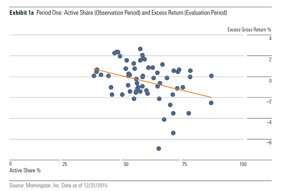
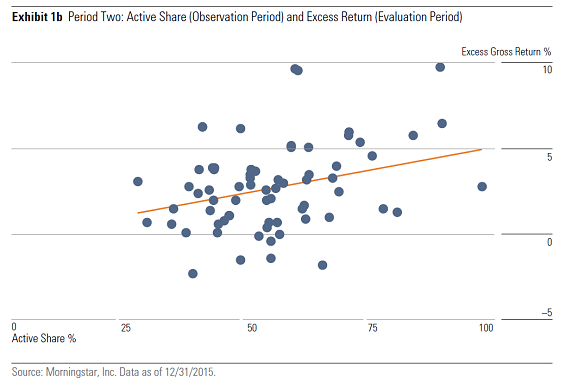
Active share proved a weak and inconsistent predictor of future returns in our study. More active funds generated lower excess returns from 2001 to 2010 and higher excess returns from 2006 to 2015. As Exhibit 1 shows, performance was about as negatively correlated with higher active share in the first evaluation period (2001-05) as it was positively correlated in the second evaluation period (2011-15).


Higher active share did not foretell better returns, but it helped explain performance extremes. One might have expected wider outcomes in a period punctuated by the 2007-08 financial crisis and its immediate aftermath. However, broad, macroeconomic themes drove returns, so stocks fell and rose together and the payoff from stock-picking was relatively low. The least active 20% of funds modestly outperformed the S&P/TSX Composite, while the remainder underperformed.
Active managers found the 2011-15 evaluation period more fertile. Stocks no longer moved in lock-step, so the potential payoff from high active share was stronger. Funds delivered positive excess returns on average across active-share levels, with the most active delivering the widest margin of outperformance. Investors benefit from higher active share in periods of high dispersion and vice versa.
Higher active share, higher volatility, bigger losses?
While higher active share went hand in hand with wider swings in relative performance, it didn't necessarily contribute to higher volatility or larger losses. In fact, there appeared to be no relationship between active share and standard deviation or maximum drawdown in either evaluation period. In both periods, the most- and least-active quintile of funds exhibited similar levels of volatility and suffered nearly identical maximum drawdowns.
| Standard deviation and maximum drawdown | ||||||
| Period 1 | Period 2 | |||||
| Active Share Quintile |
Standard Deviation |
Maximum Drawdown |
Standard Deviation |
Maximum Drawdown |
||
 |
||||||
 |
||||||
| 1 | 16.9 | -44.0% | 9.3 | -19.4% | ||
| 2 | 15.5 | -41.8% | 9.6 | -18.0% | ||
| 3 | 16.3 | -43.2% | 10.3 | -21.6% | ||
| 4 | 16.4 | -45.1% | 9.8 | -18.3% | ||
| 5 | 16.2 | -43.9% | 9.4 | -20.0% | ||
 |
||||||
| Source: Morningstar. Data as of Dec. 31, 2015 | ||||||
 |
||||||
This finding is somewhat counterintuitive. We might expect the odds of a blow-up to increase along with active share. However, low active share limits risk relative to the benchmark, not to the risks of the benchmark itself. Because the S&P/TSX Composite is highly concentrated by sector, funds with low active share will be, too. The benchmark's heavy exposure to the cyclical financials, energy and basic materials sectors makes less-active portfolio susceptible to high volatility and large losses.
The most-active funds were significantly underexposed to the Composite's dominant sectors. Treading lightly in major market sectors requires heavier weightings in minor ones, such as telecommunications and consumer staples, which tend to be more defensive in character. Rather than magnifying volatility, sector bets may moderate it. This effect is difficult to see in the data -- more-active funds weren't less volatile -- but overweighting defensive stocks may have helped tame other potential sources of volatility like heavier exposure to value stocks.
Don't forget about fees
We used gross-of-fee returns in our study because we wanted to examine active share purely as a gauge of manager skill. What matters to investors, though, is whether managers deliver good enough returns to overcome their costs.
Canadian equity funds become more expensive the more active they are. (The chart below breaks down management-expense ratios by distribution channel using the most recent MER data. Active-share quintile data uses a five-year average. We excluded do-it-yourself funds because the sample was too small to be meaningful.) Higher active share may increase the potential for stronger excess returns, but the investor won't benefit if higher costs eat the surplus. Because fund costs and future performance are negatively correlated, funds with high active share may be more likely to underperform after fees.
Some managers have used high active share as a justification for high fees. These managers, the argument goes, are truly active and worth the added expense. There may be instances where this is the case, but it also may be that these managers take more risks relative to their benchmark because they must overcome their fee hurdles.
| Management-expense ratio by active-share quintile | ||||
| Active Share Quintile |
% MER (commission- based funds) |
% MER (fee- based funds) |
||
| 1 | 2.2 | 1.0 | ||
| 2 | 2.4 | 1.2 | ||
| 3 | 2.4 | 1.3 | ||
| 4 | 2.4 | 1.3 | ||
| 5 | 2.6 | 1.6 | ||
 |
||||
| Source: Morningstar. Data as of Dec. 31, 2015 | ||||
Active share isn't a holy grail. So what?
Active share may not be the "new measure that predicts performance" as Cremers and Petajisto claimed in the title of their 2007 paper, but just because it is less useful than promised does not make it useless. It has given fund investors a simple way to understand the extent of a fund's active stock bets. Active share gives us no easy answers, but it can help us ask good questions about strategy, portfolio construction and a fund's value proposition next to cheaper passive alternatives.
Flawed as active share may be as a gauge of future performance, other measures investors commonly use to identify skilled managers, such as the Sharpe or Information ratios, turnover or manager tenure, also suffer from having little predictive value on their own. Measures like these are more meaningful together than apart. Similarly, using active share in concert with performance-based measures like tracking error and portfolio-based analysis of stock and sector concentration gives a better picture of how different a portfolio is from its benchmark. Incorporating these considerations with other research concerns, such as the depth of management's resources and the strength of its research and risk management practices, historical performance, and costs, paints a more vivid picture of investment skill.
Lastly, investors should resist the temptation to make holding less-active and more-active funds together an either/or proposition. If low active share is beneficial in some markets and high active share in others, investors could reap diversification benefits from holding them in concert.
Note: This article is an abridged version of a Morningstar paper published in January 2017. You can access the full paper here.


