It may seem like the recent swings in the markets are unique and unusual, but in the past three decades there have been multiple points of uncertainty in financial markets. Today we’ll look at different types of funds, how they performed during past crisis’, and their recovery characteristics.
Exhibit 1: Growth of $10,000 since 1992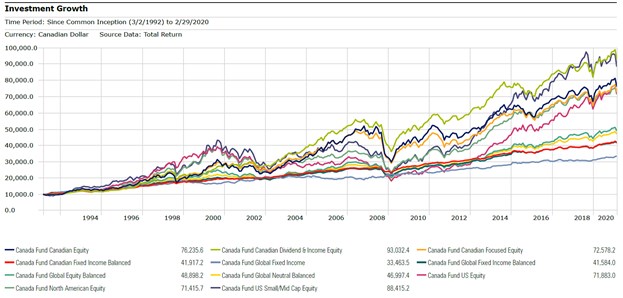
The above chart depicts the long term returns of various popular mutual fund categories within Canada. Each line represents the average returns of funds in that category with a theoretical starting investment of $10,000 CAD. In effect, this shows that that over the long term, the value of investments has gone up, with many peaks and valleys along the way. Let’s focus on those peaks and valleys.
To do this, we’ll look at a key statistic: maximum drawdown. In financial terms, this is the value of portfolio lost from peak to valley during a market correction. The subsequent period is known as the recovery phase, and we can measure this in months to determine the amount of time after a correction it takes for an investment to recover its peak value. Maximum drawdown can be a very good ‘gut check’ to help an investor understand whether an asset class is too risky for her liking. Although COVID-19 may be dominating investor outlook now (a term known as recency bias), remember that we’ve had large swings in the past and ultimately it is risk tolerance that should determine what asset class mix is suitable an investor’s long-term financial plan.
The charts below plot the maximum drawdown (horizontal axis) against the recovery period (vertical axis). The closer a category is to the left, the more severe the drawdown. The closer a fund category is to the bottom, the faster it recovered from its drop. Fund categories on the bottom right of the chart can be regarded as more conservative. Also included is a table of returns over the timeframe and months where the peaks and valleys occurred.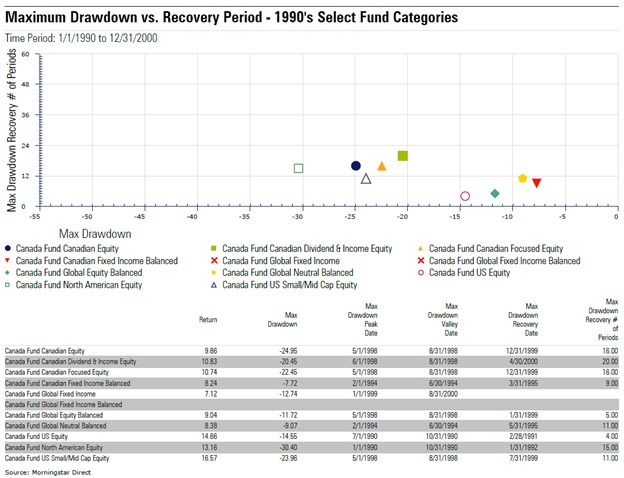
The 1990’s brought with it the end of the Cold War, the Persian Gulf war, the Asian currency crisis, and the creation of the North American Free Trade Agreement. During this time, the maximum drawdown amongst popular fund categories ranged from -8% (Canadian Fixed Income Balanced Funds) to -30% (North American Equity Funds). Most categories recovered within 24 months, but there was one category of funds that did not recover during this time period (Global Fixed Income), and one category that did not experience a drawdown (Global Fixed Income Balanced) – denoted by the red ‘x’ on the chart.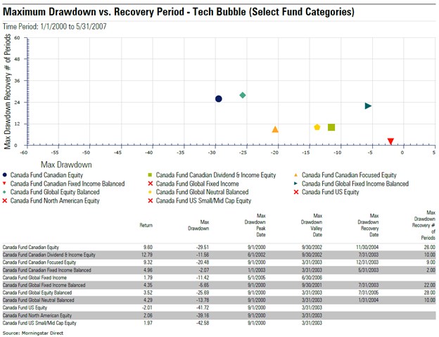
The early 2000’s to most investors stirs up memories of the tech bubble as well as the 9/11 attack on the world trade center. During this period, maximum drawdown ranged from -2% (Fixed Income Balanced funds) to -43% (Canadian SMID Cap Equities). Over this short seven-year time frame, a few categories of funds were not able to recover their peak value including North American equities and global fixed income funds.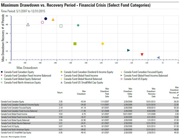
The crux of drawdown over the last three decades happened during the credit crisis of 2008-2009. Over this time frame the market experienced its largest drawdowns in recent history ranging from -6.7% (for Global Fixed income funds) to -49% (Canadian Small/Mid Cap funds). Most fund categories took between two and four years to recover back to their peak values. By 2013, all fund categories had recovered back to their pre-crash levels.
Across all three major financial events, it appears that the Canadian fixed income balanced category showed a combination of small drawdown followed by a quick recovery period. Funds in the Canadian Fixed Income Balanced category hold 60-95% in CAD denominated bonds (with the remainder in equities) and no more than 30% foreign exposure. Here are the top-rated funds in the category today inclusive of their recent returns:
|
Name |
MER (%) |
Morningstar Rating Overall |
Morningstar Quantitative Rating |
YTD Return (%) |
1-yr Return (%) |
3-yr Return (%) |
5-yr Return (%) |
10-yr Return (%) |
|
Compass Conservative Balanced Portfolio |
1.61 |
5 Star |
Bronze |
-6.92 |
-2.37 |
1.42 |
2.22 |
5.30 |
|
Compass Conservative Portfolio |
1.30 |
4 Star |
Silver |
-3.54 |
0.68 |
2.45 |
2.55 |
4.66 |
|
Fidelity ClearPath Income Portfolio F |
0.80 |
4 Star |
Bronze |
-3.38 |
0.72 |
2.19 |
2.11 |
4.46 |
|
RBC Managed Payout Solution F |
0.74 |
4 Star |
Gold |
-7.06 |
-2.09 |
1.63 |
2.48 |
4.37 |
|
RBC Retirement Income Solution F |
0.85 |
4 Star |
Silver |
-4.23 |
0.25 |
2.22 |
||
|
RBC Select Choices Conservative Port F |
1.14 |
4 Star |
Bronze |
-8.41 |
-2.48 |
1.38 |
||
|
RBC Select Very Conservative Port F |
0.85 |
5 Star |
Silver |
-4.63 |
0.47 |
2.41 |
2.60 |
4.40 |
This article does not constitute financial advice. It is always recommended to speak with a financial advisor or investment professional before investing.


.jpg)